The Problem
BJ’s email system was built for desktop, even though most members were opening on mobile.
As mobile engagement increased, the system became inconsistent, inefficient, and hard to
scale, making it difficult for the email channel to grow revenue and stay on brand.
As mobile engagement increased, the system became inconsistent, inefficient, and hard to
scale, making it difficult for the email channel to grow revenue and stay on brand.

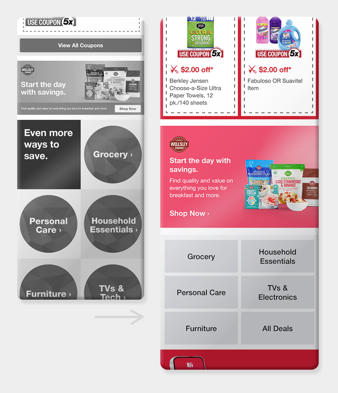
Before mobile-first to after mobile first
The Audience
BJ’s members who primarily read emails on their phones and needed a clearer, faster shopping experience.
The Insight
Approximately 60% of BJ’s members view emails on mobile.
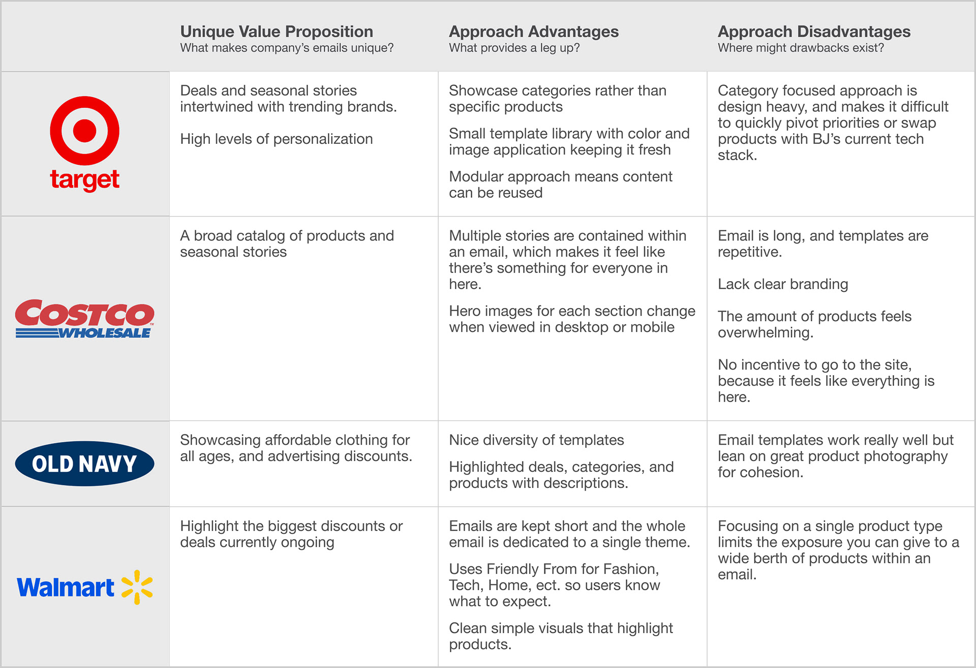
Through research into Target, Costco, Old Navy, and Walmart, it became clear that the most effective retail email systems relied on modular components, consistent hierarchy, and strong mobile-first layouts. These systems allowed teams to move quickly without sacrificing brand consistency or clarity.
The Strategy
The goal was to build a modular, mobile-first design system that could scale across promotions, seasonal campaigns, and evergreen messaging. The system needed to improve usability for shoppers while also making production faster and more consistent for internal teams.
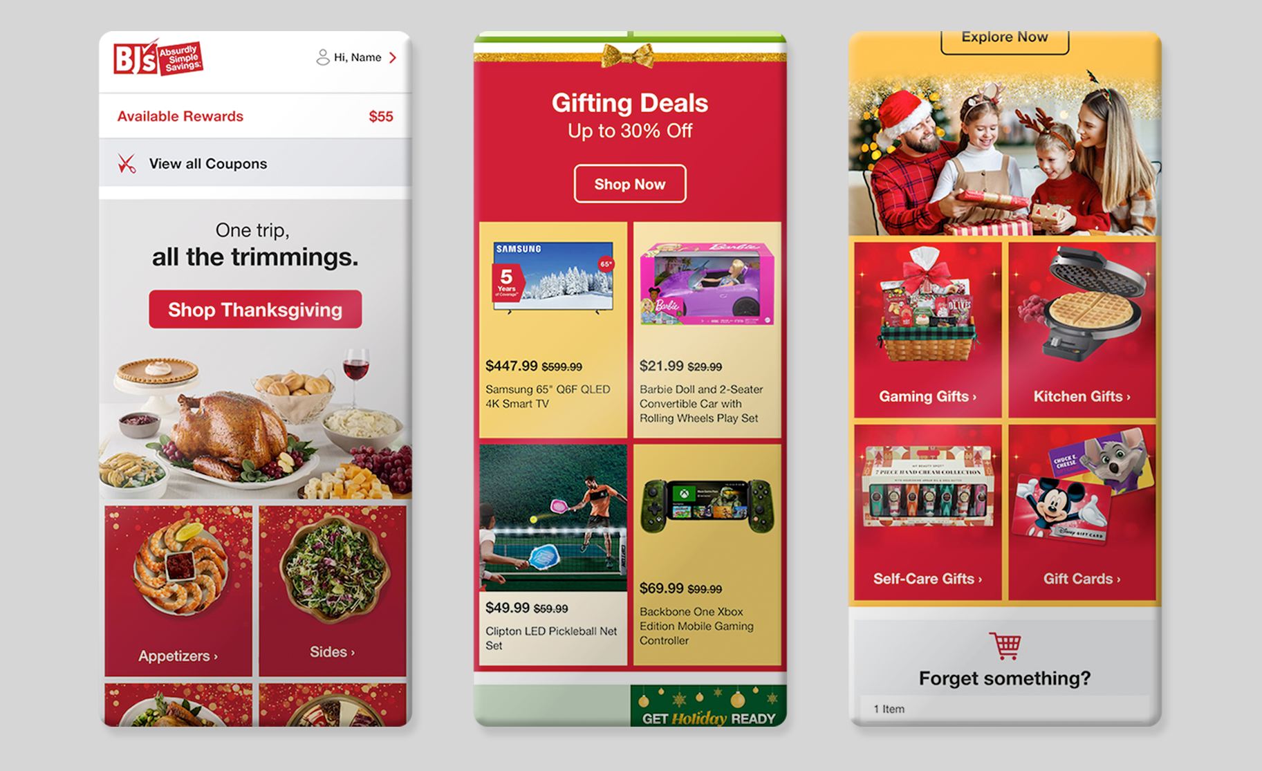
Holiday themed email
The System
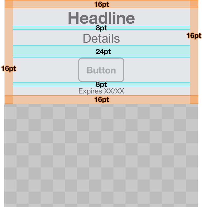
8-Point System
To create consistency across the entire library, the 8-point system was applied to typography, spacing, grids, and image heights. This instantly unified layouts and made components easier to reuse and scale.
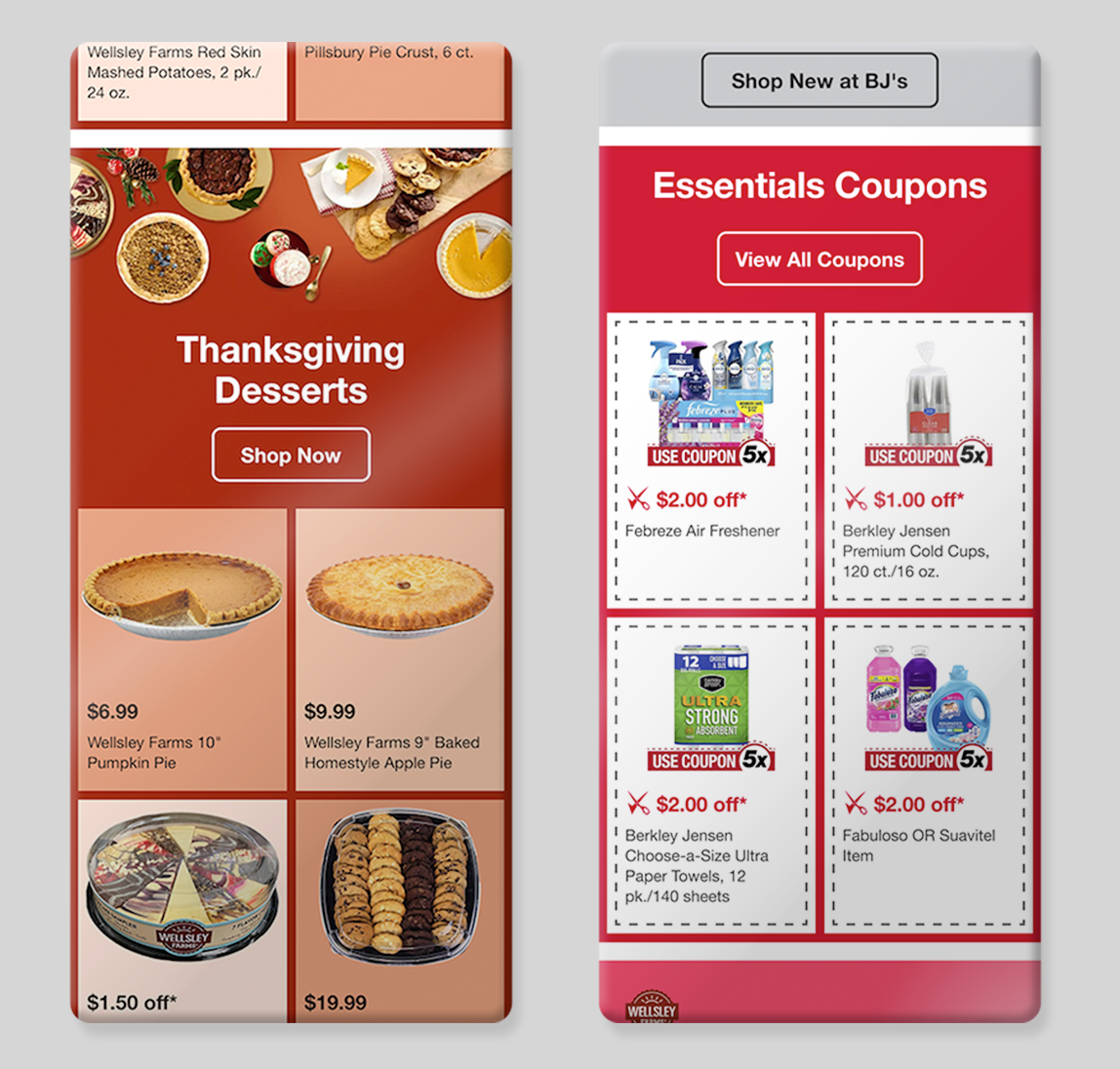
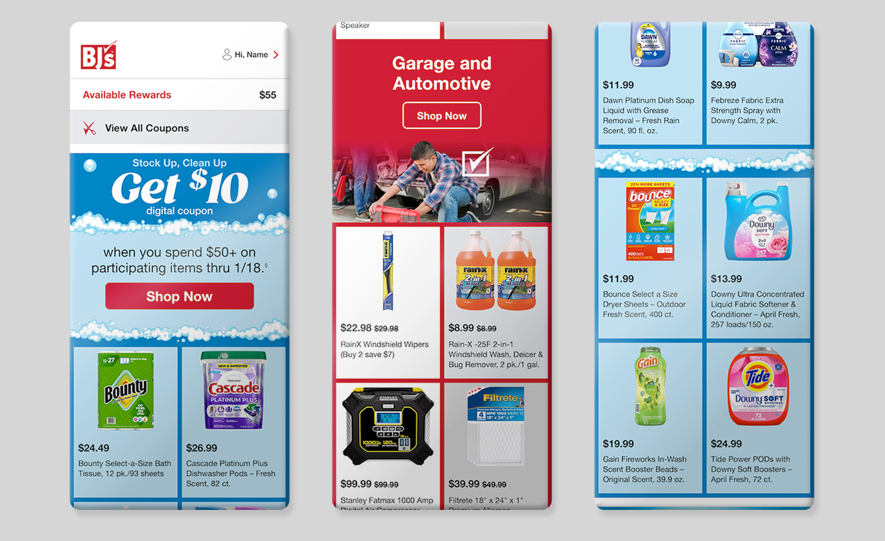
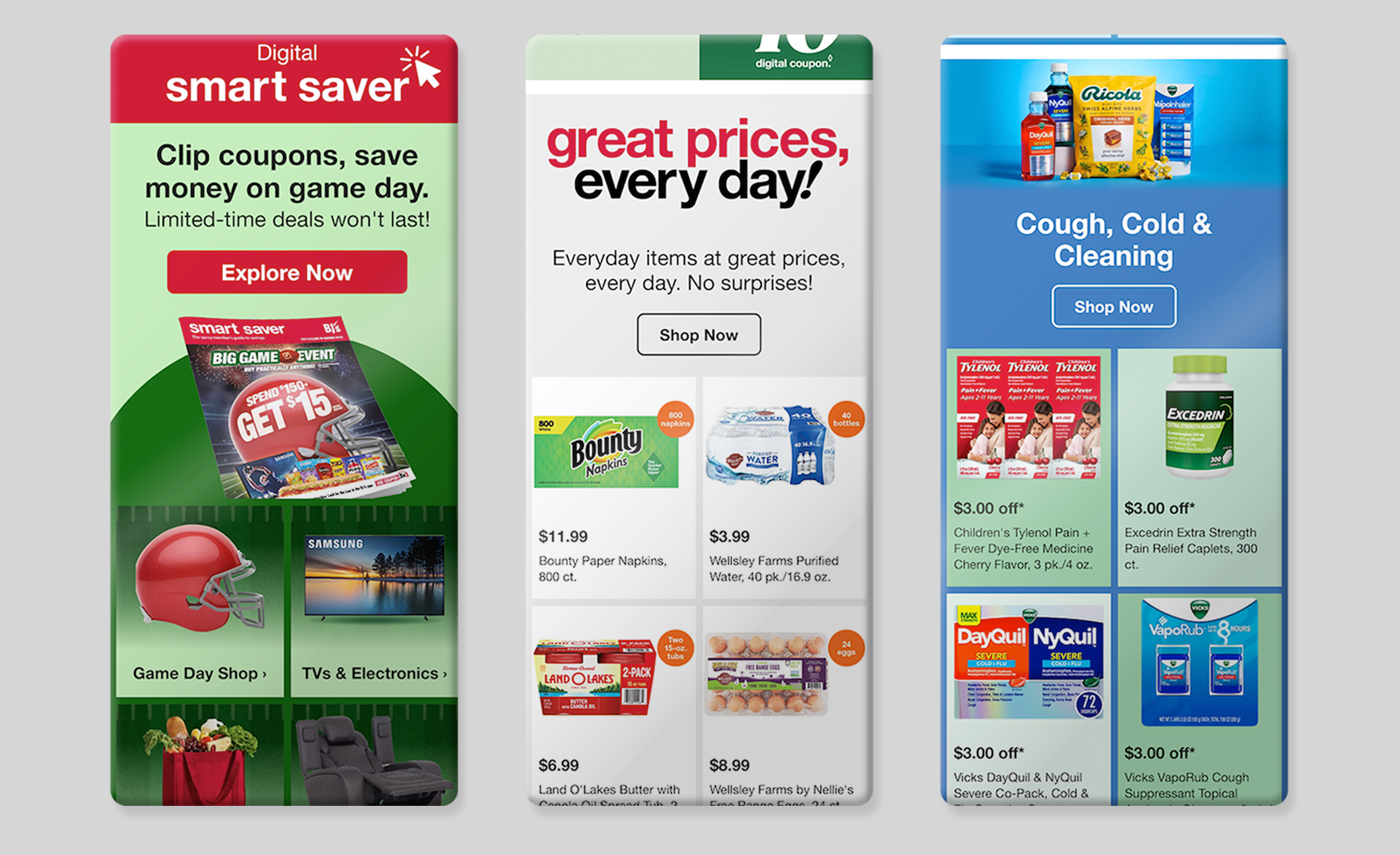
A Modular Approach
I designed 33+ modular components that could be mixed and matched across campaigns.
Modules allowed emails to be automated and templatized while still feeling custom and
on-brand.
Modules allowed emails to be automated and templatized while still feeling custom and
on-brand.
Grid headers could be swapped between three layouts (top image, bottom image, or no image),
keeping emails visually fresh while maintaining structure.
keeping emails visually fresh while maintaining structure.
Figma Library & Documentation
To ensure long-term adoption, the full system was documented and organized into a shared Figma library:
Design Foundations – Type styles, spacing rules, and image height options
Components – Core UI elements
Modules – Reusable content blocks
Templates – Evergreen layouts for common use cases
Components – Core UI elements
Modules – Reusable content blocks
Templates – Evergreen layouts for common use cases
Because many designers at BJ’s came from a print background, the documentation also included best practices for image compression, accessibility, and color contrast.
The Results
The mobile-first system launched on November 1, 2025 and delivered immediate impact:
• ~6 hours saved per designer in production time
• Image sizes reduced from ~800kb to ~200kb, improving load times without sacrificing quality
• 146% increase in traffic from email
• 400% year-over-year revenue growth
• 175% of projected revenue achieved in the email channel
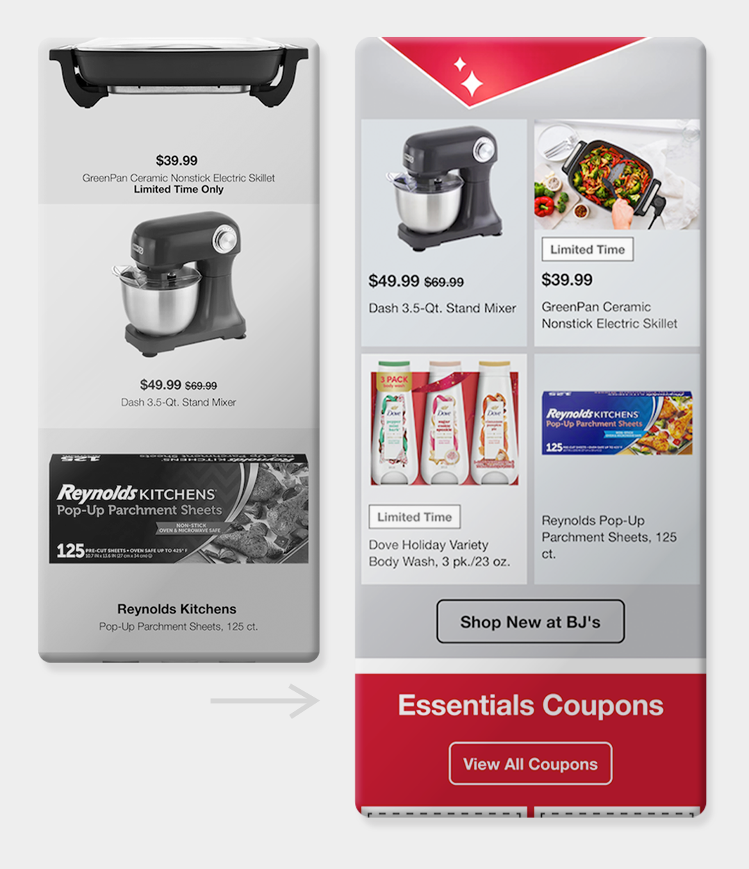
Before & After
The redesign dramatically improved both performance and usability.
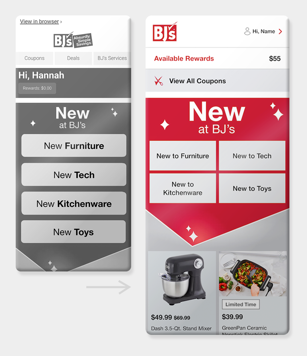
Navigation & Hero Updates
• “View in Browser” moved to the footer
• Navigation simplified to highlight top-clicked links
• More space optimized above the fold
Product Grids
• Products displayed side-by-side for easier mobile browsing
• Simplified information hierarchy
• Modular headers with clear CTAs
• Stronger alignment with BJ’s branding
Non-coupon products
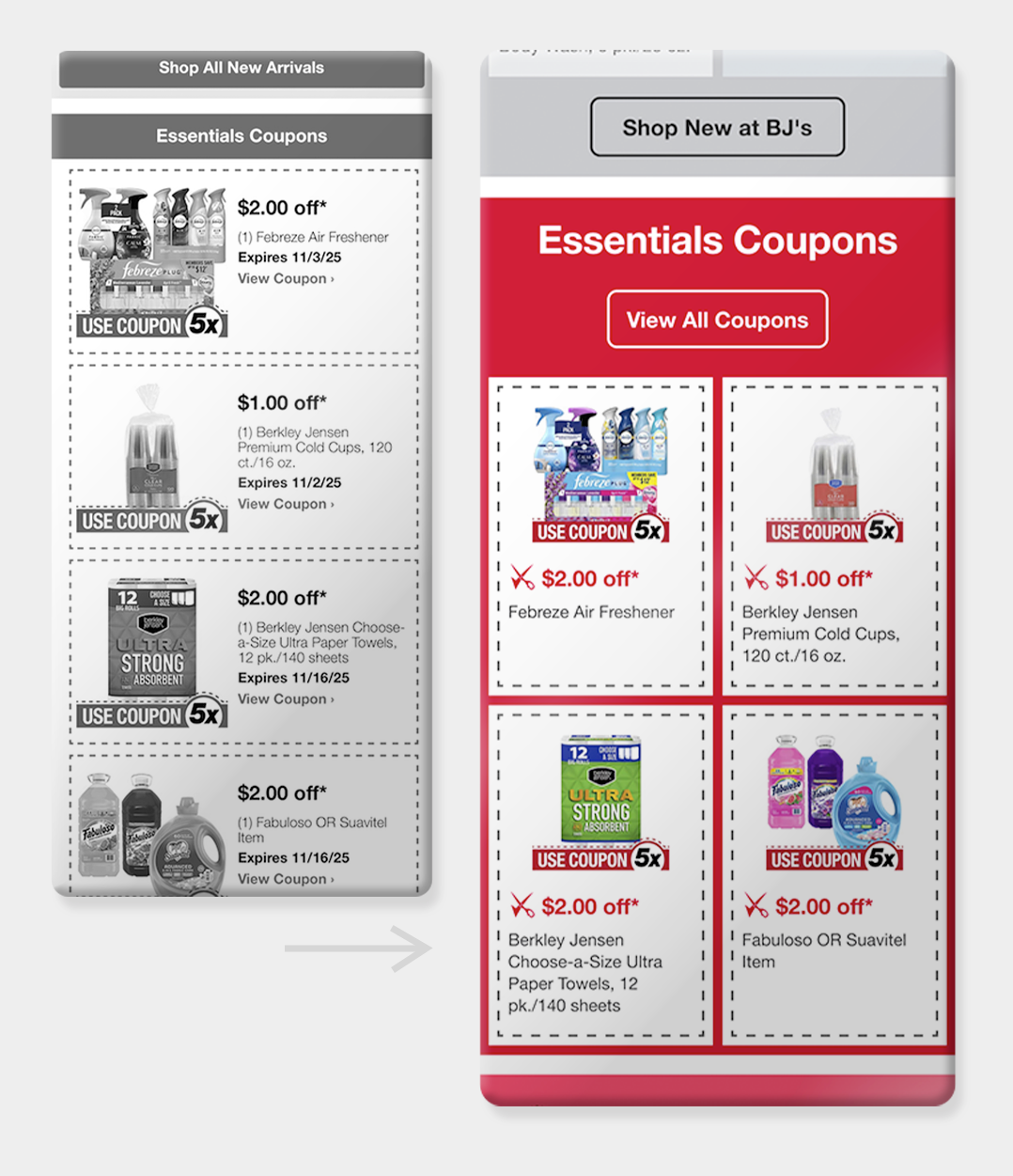
Clippable Coupons
Banners
• Flexible template system for outside teams
• Live text prioritized over flat assets for better accessibility and consistency
• Live text prioritized over flat assets for better accessibility and consistency